Patchwork rose

Patchwork rose

Saturday, January 21, 2012

Clean & Simple, Day 9

Hello again,

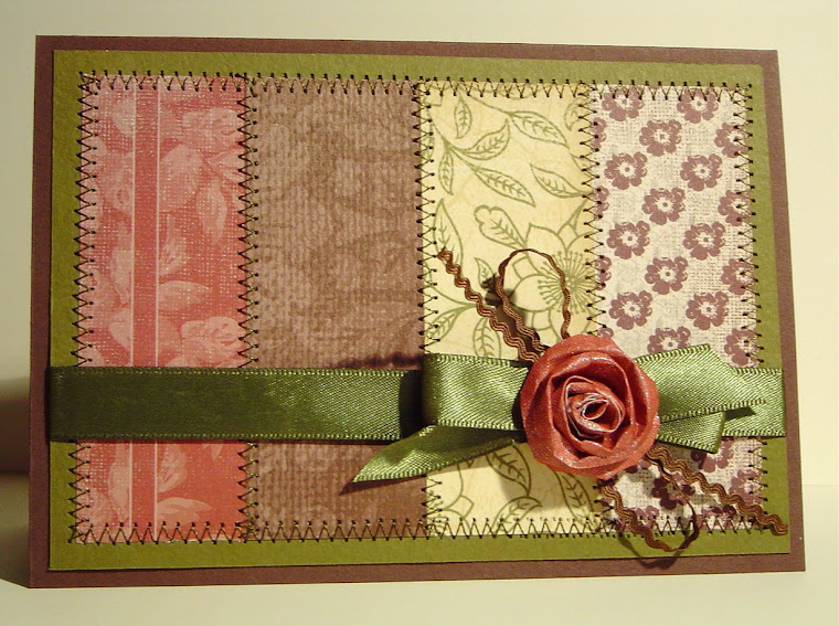
Here is my latest card, inspired by Jennifer's white on black stamping from Day 9 of the Clean & Simple card class.


I have to say that, while I quite like the finished product, I don't think I would regard this as a clean & simple technique - the colouring took me AGES...but I have learnt a few things about how to do a better job in future! I used Papertrey fresh snow hybrid ink and watercolour pencils, as they are the best pencils I have. However, they are quite soft & I think maybe weren't the best choice. They blunted quickly & I was too lazy and/or impatient to keep resharpening them to a fine point so it was quite difficult to stay within the white stamped image. After I'd coloured it all, I was unhappy with the blurred look I'd achieved where the colouring had moved onto the black cardstock, so I resorted to fixing up a few of the largest errors with a brush-tipped black marker. Of course, once I'd started this I kept finding more & more to fix, until eventually I think I outlined every single edge. The outcome was a much crisper image, but it took almost as long as the colouring did! In future I'd be MUCH more careful to colour accurately in the first place, and insist on super sharp pencils all the way through. I know Jennifer kept reiterating this...but now I believe her! I'd probably also try to leave the ink to dry for a day before I started colouring. I did heat set the ink, but there were still a few problems with the ink not being perfectly dry in some places.

Another tip: don't use textured black cardstock! It made the colouring much harder as it was difficult to get the colour into the valleys of the card, even in some places where the ink had managed to reach.

I've also become much more aware of the importance of accurate placement of various panels and matts in clean & simple card making. This card is a perfect example! I had the yellow matt accurately cut but when I stuck the black cardstock down I didn't line it up exactly enough, so two edges of yellow were wider than the others. So then I tried to fix it by trimming just the tiniest line from the two wider edges...and of course, went too far! When I've had similar issues with other cards I've made in the past, it's usually been relatively easy to cover up such inaccuracies with ribbon, a tag, or some other distraction, but in C&S designs it's impossible!

So....I learnt a lot form this card - which is, after all, the point of taking classes, huh?

Thanks for looking! If you try a similar technique yourself, I hope my experience helps save you some time.

-Kerri

Clean & Simple, Day...err, I've lost track!

Hi there,

Clean & Simple card camp is wrapping up on Monday & I'm frantically trying to have at least one card finished for each of the techniques/approaches we've learnt before then, so there will be two posts today, each with one finished card.


I have lost track of which day inspired me for this card - but the basis was the idea from one of the guest teachers that objects which appear high in the sky (eg. butterflies) should be placed high on a clean white space and objects which are ground-based should be low on the card front. I've had this city stamp from Hero Arts for a couple of months, keen to use it but struggling to find a purpose for it during my Christmas craft frenzy.


It was an amusing throwback to paper tole, which I dabbled in for a year or so a long time ago. The city image was stamped 5 times, then fussy cut into 4 layers to stick onto the main card, each layer leaving out some of the buildings in the immediate background of the previous layer. I was tempted to use dimensional dots for each layer but didn't want it to get too bulky, so I only used them on the bottom layer, then regular glue on the other layers. I'm not sure it's got quite the right amount of 3D effect...maybe a little more was needed.

I was going for a Sesame Street look - there's one particular cartoon I've seen a few times...or maybe it's the latest opening credits? Anyway, a cartoonish, fun city scape. I used distress inks and an aquabrush. If I was to make a similar card again I think I'd only colour a few of the buildings - it was quite striking just in black & white.

Stay tuned for another post very soon. Thanks for visiting!

-Kerri

Thursday, January 19, 2012

Clean & Simple, Day 7

Hi there,

Thanks for visiting.

I'm trying desperately to keep up with the daily ideas from Card Camp but it is a huge challenge and I am slipping behind. I hope to catch up a little on the weekend...famous last words! I have so many ideas and inspirations in my head that it's difficlt to know what to do next, let alone find the time.

The card I have to show today was inspired by the Day 7 theme of white cards by Julie Ebersole. In the past I have been one of the people Julie referred to in her video who ran away screaming when the idea of a largely white card was mentioned, but these past few days of trying to stick to clean & simple designs has given me a little more respect for the idea, and - hopefully - a few more ideas about how to make such a card look great rather than just plain. I think in this case the use of textured white cardstock rather than regular flat has made quite a bit of difference to the final outcome, so I'll definitely be using that idea again.


I have been sticking to the plan to use all of the as yet untouched stamps in my craft room, and today's card uses one such stamp. As soon as it hit the cardstock in Versamark I was in love with it, wondering why on earth I haven't used it before! In case you're interested, it's from the Butterfly Garden set by Pink Paislee. I plan to use it more in the coming days, too, so it might become part of a "1 stamp 3 ways" theme before the classes finish for me.

Typically, though, as soon as I had "finished" the card I was thinking about what else I could add - rhinestones, ribbon, buttons....it's very hard to change old habits! It took great restraint and some admonishing from a friend who was crafting with me at the time to leave it so bare. Looking back at it now, I am glad I did.

I hope you're getting a lot out of card camp, too, if you're participating.

-Kerri

Monday, January 16, 2012

Clean & Simple, Day 6

Hi again,


Today's Card Camp focus was about using clean and simple embellishments. I LOVE embellishments, so this was right up my alley.


I'm not completely happy with this first card, but I really like the layout Kristina provided and the colour combination. I was also inspired by the idea of layers of tissue paper shapes, from the butterfly card we saw in one of the links.

I couldn't resist adding some very subtle sparkle to the stamped image with some perfect pearls, although it doesn't really show up very well in the photo. The shot is pretty dodgy, too - it was quite windy outside and trying to take the shot before the card blew over was a challenge. I could have taken more time to get it right, but as usual I am posting this in a huge hurry before I go out for dinner. This will have to do for now. I think I'll have another go at the simple embellishment idea again tomorrow....

Thanks for stopping to take a look!
-Kerri

Clean & Simple - weekend 1

Hi there,

I was very excited to see the extra links & ideas from the Clean & Simple card class posted on the weekend, and one of the links I followed gave me the inspiration for this card. It's a masculine card - yay! They are always so difficult for me - you can rarely get away with ribbons and glitter! This one will be my dad's birthday card, coming up in a few weeks. I'm really happy with the retro look of the card, and the unusual colour combination which is WAY out of my normal sphere. I even managed to take the shot of it in natural light, so I am making progress.


One of the things I like most about the card class - this time and the previous camps I've participated in - is the inspiration they provide to try something new and expand your repertoire. It's not always easy or comfortable, but definitely worth the effort and persistence required.

Thanks for visiting.
-Kerri

Saturday, January 14, 2012

Clean & Simple, Day 5 - part 3

Hi again,

Here is the final card I've made today, using the Kaisercraft "Miss Nelly" rose stamp. I wanted to make an elegant wedding card this time, using one of my new favourite colours, very pale pool blue. The first version was awful:


It was too dull, the bold black I had imagined wasn't there because the sentiment font was too narrow. The curly border didn't suit the rose...in all: UGH. It looked like a card I would have produced years ago, when I first started.

However, I was determined to make 3 different cards I was happy with using this stamp. So I took a break, thought more clearly about what the important elements were in what I was imagining, and had another go - this time with much better results, as I am sure you will agree!


I am not completely sure it's finished yet - maybe a line of hand-drawn black stitching is needed along one of the front edges? Let me know what you think.

I am happy, though, that I have used some of the ideas from Shari Carroll's Day 5 card on this - the narrower card front revealing the pattern border on the inside, and the overlapping sentiment tag/flag. I am also very happy with the fact that when the card is shut, the faint rose image on the front lines up with the partially-hidden embossed white rose on the black panel. Something to try again in future, I think!

I am feeling a teeny bit better about the C&S style - a relief, after a few days of stressing and feeling incompetent! Bring on Week 2. If you're participating in the class, I hope you're experiencing a similar sense of growth and challenge.

Thanks for visiting.
-Kerri

Clean & Simple, Day 5 - part 2

Hi there,

Here is the 2nd use of the Kaisercraft 'Miss Nelly' rose stamp. The colours are undoubtedly influenced by this card by Tami Hartley, from a card class link. I LOVE her card, but didn't want a direct case, so I stuck to the colours. I also used the idea of a thin coloured strip along a card edge from Shari Carroll's Day 5 card, and I made some minor changes to one of the sketches from Day 1. So, I think I've also managed to use Julie's idea of gathering a few small inspiration points and incorporating them into a single card. Yay!

I'm pretty happy with this one - mauve is one of the colours that makes me melt, so I could hardly go wrong this time, ha!


Thanks for looking. One more use of this stamp to follow.
-Kerri