Patchwork rose

Patchwork rose

Saturday, January 14, 2012

Clean & Simple, Day 5 part 1

G'day! Thanks for visiting.

Today I decided to use a single stamp in multiple ways, much like the Day 4 cards we saw in the card class, but so I can add them to the card class gallery, there will be three separate posts for Day 5. I chose a stamp I really like but had not yet used, from the stash on my desk which I'm forcing myself to use this week. It's a rose, from Kaisercraft's Miss Nelly clear stamps set. I also have the 6x6 Miss Nelly pad, so I started with finding a paper from it that I could use with the stamp:


I also took the idea of using a bacground or texture stamp inside another stamp image, so the large rose has a white grid stamped underneath the red embossed layer.

I am loving the scattered look of pearls and rhinestones on the cards shown in the class, so I am trying to emulate that look. However, I am never sure about where or how many of these to use! This looks OK to me now (it didn't when I made it) but I think I need more practise & skill on this point.

See the next post for the 2nd use of this beautiful rose stamp, if you're interested.

-Kerri


Clean & Simple, Day 4

Hi there,

I am almost caught up with my posts for the card class - yay! It's a bit weird to be posting so many times on one day, but I am trying to keep track of how the cards I've made match up with the days of the card class. So here's what I did on Day 4.


I was quite taken with the idea of using stamps in multiple ways. I am a shopping addict when it comes to stamps, paper and embellishments. I always have plans for the stamps I buy when I buy them, but I foften acquire them faster than I have time to use them. So, when I thought about using stamps in new ways, I decided to take a slightly different tangent and use stamps I own but have not used before. So I have a small pile of stamp sets on my desk which I'll try to work through in this class.

I felt like making something girly, but the stamps I piled up took me somewhere else! I have had a particular Stampin Up set for several years, but it never seems to get used as I couldn't really picture it on a card. But the C&S card I made for Day 2 gave me some confidence to try another card with lots of white space, which the stamp set suited:


I struggled to find a sentiment that matched the goldfish in a bag, but I figured this one worked better than anything else I had - I'll use the card for someone having a difficult time dealing with change in their life - maybe a new job? Or a reluctant relocation? Then again, it might just sit in my 'ready to use' card pile for years, lol.

Again, the C&S approach was a challenge. I stamped everything twice before I was happy with it - there are lots of sloppy, discarded (ha!) versions in my bin this week.

The plastic bag was stamped with StazOn black ink on acetate, so it's shiny and 'bag-like' in real life, and tied with some black twine. The goldfish has a life-like shine, too, thanks to some Twinkling H20s in orange.

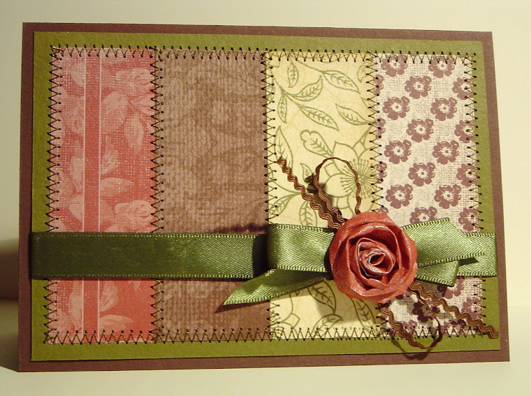
As an antidote to this very clean, restrained style, I couldn't resist making something much more typical of me - lots of layers and stitching and some lace and twine and a button...heavenly! This card took MUCH less time than the fish, ironically - because I was back in familiar territory? I hadn't ever used this stamp set, either, though, so I'm still attributing the inspiration for it to the card class.


Thanks for looking.
-Kerri
Clean and Simple, Day 3

Hi there,


Today's C&S card class explored the idea of where to get inspiration, and how to incorporate ideas into a card. I initially planned to try the letterpress layout that Julie showed on Day 2, but as I worked on the card it took on a life of its own. The finished version is a RADICAL departure from my usual style - if you've looked at my previous blog posts I'm sure you'll agree!


The photo doesn't show the other details I couldn't resist adding: the castle turrets are coloured in with Twinkling H20s in iridescent red, so they shine subtlely in the right light, and the rest of the castle is covered in Rock Candy Distress Stickles, so it glitters in the light. Even still, I had to force myself to resist adding more bling. It seems I am a layering, embellishment addict!

The sentiment and fairy princess that I had planned to put on the front of the card ended up in the inside, which I think has turned out well.


I know a soon-to-be one year old who's having her first birthday party next week, so this card should find a happy home very soon. (And she's too young to care that there's no ribbon on the card, ha!)

And I will also add that I stamped the castle THREE times before I was happy with it. This Clean & Simple stuff is anything but!

Thanks for visiting.
-Kerri


Clean and Simple classes, Day 2

Hi there,

Here is my take on the Day 2 card class inspiration, which was about perfectly flat cards. I haven't made a perfectly flat card for a Very. Long. Time! But, with the spirit of giving everything a go which I am trying to apply to life in general, I forced myself to try this.

A friend of mine who is also doing the card class came over to my house and we worked on it together. We were all thumbs! There was ink smudged everywhere, lots of sighing and minor swearing as things kept going wrong. Cards were abandoned, mistakes desperately tried to be reversed....I even spilled embossing powder all over my desk. Ridiculous! I've been using it for years and I don't remember ever having spilled it before....it all seemed to sum up the extreme challenge of what is, on the surface, a very simple-looking card outcome.

My first version was a disaster. but the second was acceptable...if you don't look so close that you see the spots of watercolour that mar the green masked section, ha! Fortunately, my own scrutiny of this card is likely to be much more critical than whoever ends up the recipient of this card. Again, my photography skills are hopeless and the colours don't look true-to-life. The flowers are a subtle salmon pink. Even now, looking at the photo, I'm itching to add some ribbon or a button, or a new layer over the entire thing....


So. Still LOTS to learn about feeling confident and skilled in this style!

Thanks for visiting.
-Kerri

Clean and Simple, Day 1

Hi there,


Even though this post is a few days late, I've been trying to keep up with the ideas and techniques presented in the Clean & Simple on-line card class by doing some card making each day, inspired by the day's video and card ideas. Day 1 presented some sketches to use and the idea of making monochrome cards with a border created by masking the central area. This is my take:


I had planned to add the three small elements above the sentiment using matching coloured buttons, but they filled up too much of the central area because I'd used such a large sentiment....so I switched to a single button with a scrap of black ribbon on the side, instead. I was going for a super-modern style using bright colours and damask. The colours are more vibrant in real life, so I think this was a relatively successful attempt. (Thankfully the photos hide the extra tiny spots of black embossing powder smeared amongst the damask. Oops.)

But BOY OH BOY have I got a lot to learn about Clean & Simple style! I had to fight my instincts so hard with these cards...I've been working consistently for years at adding more and more to my cards while trying to keep them from looking overdone. This clean & simple stuff is turning my brain inside out as it requires the opposite! And I've also developed a whole new respect for the creators of the beautiful C&S cards I've seen on the internet. I had no idea of the skill and control and confidence it takes to make a truly beautiful, crystal clear C&S card. I'm realising that my stamping skills may not be precise enough to carry this approach off, despite many years of practise and feeling smug. :(

So, another huge learning curve...but I am definitely enjoying the challenge!

Thanks for visiting!
-Kerri

Clean and Simple

Hi there,

I'm participating in the Clean and Simple Card Class this January run by Kristina Werner, Jennifer McGuire and Julie Ebersole. It's perfect timing again, as I have to return to work in two weeks after a HUGE length of time off....the card class seems like a last hurrah before the routine and tedium of regular working hours kicks back in. So until then, I'm determined to make the most of the time off by making heaps of cards...maybe enough to get me through all of the birthdays, anniversaries and other occasions I'll need cards for until Easter? Time will tell, huh?

So, knowing I was going to change gears to make Clean & Simple cards, I had a few warm-up attempts before the class started. I used a recently-purchased poppy stamp from Hero Arts, stamped it a few times & coloured it in several colour versions using watercolour pencils. Only two of the images have made it to a card so far, but here they are. The photo of this first version hasn't really shown up the subtlety of the colours - the flowers are a mix of orange, yellow and shell pink, which I think is a reasonable imitation of the real flowers.


The purple version turned out beautifully - I am really happy with this card. It's nice to enjoy the moment, don't you think, when a card you have envisioned actaully turns out looking just as good in real life? If only it happened like that every time!


The actual card-camp-inspired photos will be posted in separate posts, so I can add them to the card class gallery, so stay tuned for more if you're interested.

Thanks for visiting.
-Kerri

December cards

Hi there,

I haven't posted in ages, as you might notice, but I have been very busy cardmaking and decorating Christmas presents over the last month or two. The cards below are some of what I've been busy with - the ones I managed to take a photo of before I gave them away, that is.

To save time as I have so many photos to post today, I'm not going to give the usual supply details, but if you want to know more about a particular stamp or other such detail, please leave a message & if I can find the answer I will reply. Some of the photography is a little disappointing - I really need to figure out how to organise myself to take the photos in daylight hours!!! In general the cards are brighter & whiter in real life, but you'll get the idea.

First up, a remnant from Holiday Card Boot Camp - I didn't get around to posting it at the time. I quite like pink Christmas cards and the velvet ribbon on this looks great in real life (in my opinion, at least).


A subtle birthday card, on Sahara Sand cardstock, with shell pink colouring done in watercolour pencils:


A wedding anniversary card for my dear sister & brother-in-law, celebrating their first year of marriage. They both have green as their favourite colour, so the decisions on this one were easy!


A birthday card, using some of the techniques I've learned in the on-line card classes I've written about previously:


A "baby girl" card, using a stamp I've had for ages but never used:


The Christmas card I gave to family & friends this year, mass-produced over about 2 weeks. I think the next round of Christmas cards I make will be simpler - this one was the most over-the-top I've made so far, courtesy only of the extra free time I've had due to being on long service leave!


That just about catches me up until the Clean & Simple Card Class started on 9th Jan - I'll have several more posts following which show the cards I've made while doing that course.

Thanks for looking - I hope you enjoyed your visit!

-Kerri