It's the night before Christmas....card camp, that is! I can't wait to start. I should also be getting my latest PTI package in the next day or two because according to the tracking info it's now cleared customs in Australia. Yay! So, lots of card making in the next couple of weeks, I hope.
In the meantime, I've made a couple of baby cards for a friend from work who had a baby recently. I wasn't sure if she'd had a boy or girl, so I made one of each. I've since discovered that the baby is a boy, so now I can send the card and save the baby girl card - I have no doubt it will get used soon, at the rate babies are arriving.
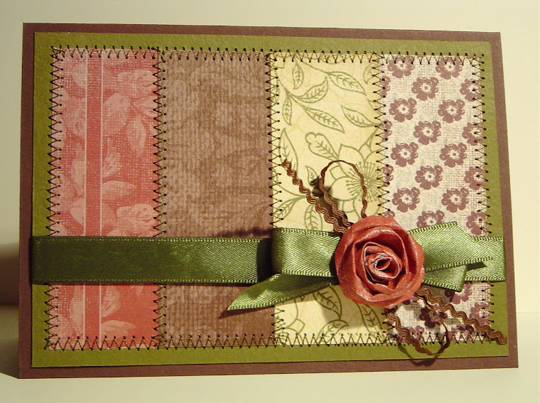
The baby girl card uses a stamp I bought months and months ago and hadn't yet used. I am just beginning to learn how to colour hair so it looks real. I think this is a reasonable effort but obviously there's a lot of improvement that could be made....Basically, I REALLY want to buy some Copics but can't justify the cost unless I build up my colouring skills to warrant them. I had intended to colour the whole image but gave up and paper pieced the dress and teddy instead. Oh well. The torn strip on the tag is covering up a stamping error, which then dictated the torn edges on the background paper. It's a little obvious to a card maker, I think, but probably wouldn't ccur to others as a "fix-it" (I hope).

Details:
Stamps: Bells 'n Whistles "Eden with Teddy", SU! "So Many Sayings"
Ink: Memento Rich Cocoa
Cardstock: SU! (Retired) Blush Blossom, white, scrap dark brown
Paper: Marianne Design "Sweet Romance" 6x8 pack
Other: seam binding, PTI silk ribbon dyed with SU! Blush Blossom reinker, vintage button, white tag from stationer, water colour pencils
Tools: Spellbinders Labels 11 die, PTI die (maybe from the Friendship Jar series?)
With this card I was trying really hard to avoid making a typical pale blue card. I remember when my sister had a baby boy that almost every single card they received was pale blue & white! I still went with blue, but tried for a stlightly funkier feel with some more energetic paper and an aqua shade rather than sky blue. In RL the aqua tones come across more strongly.

Stamps: PTI Bitty Baby Blessings, Stampabilities Tapestry Pattern
Ink: Versacolor Black, Versamark, Broken China Distress Ink
Cardstock: white, SU! Blue Bayou (is this one retired, too?)
Paper: Basic Grey Out of Print 6x6 set, My Mind's Eye Hattie 6x6 set, Webster's Pages Ladies & Gentlemen & Trendsetter 6x6 double pack
Other: white cotton (hard to see in this photo - a zigzag along the scalloped piece), ribbon, dimensional dots, aqua marker
Tools: Spellbinders Labels 2 die, Tim Holtz/Sizzix Alterations die - On the Edge
That's all for now, but hopefully there will be another post soon. Thanks for visiting.
-Kerri
No comments:
Post a Comment