Patchwork rose

Patchwork rose

Friday, November 18, 2011

Glitter galore!

G'day,

This is my second post for today, so scroll down to see the first, if you're interested.


This card is about as girlie as I can get, I think. I  L-O-V-E girlie cards, the pinker and sparklier the better, but I don't know ANYONE amongst my friends and family who has such sugary taste, so I rarely get to indulge it. But with this card I pulled out all the stops and added lots and lots of shine and sparkle and bling. It's still pretty subtle, though, because of the muted colours I've used. A lot of the sparkle isn't showing up in the photos (of course - it's insanely difficult to photograph sparkle, in my opinion). I probably should have chosen a different backdrop for the photo, too, as I think the busy-ness of the script in the background is stealing some of the card's thunder. In case you're interested, I've used an irridescent sparkle embossing powder over the dark brown stamp on the left, Rock Candy Stickles on the holly sprigs and angel wings, mica flakes on the angel's dress hem, rhinestones and shiny tapestry thread.


My inspiration is the general style of Melissa Phillips (click on her name to see her blog) - I adore her cards but wanted to try here to emulate her style rather than case a particular card. I still haven't quite captured it, but I'm sure it's artistically better to be developing my own style, anyway! I've also used the card sketch from Day 6 of the Holiday Card Boot Camp - I've never done a curved edge on a card before, so this is another first attempt for me.


Here's another photo of the card (specifically for the HCBC gallery link).


Details (this will be a long list):

Stamps: Inkadinkado Large Flourishes, PTI Love Lives Here: Holiday
Ink: Versacolor Pinecone, Burgundy & Petal Pink, Versamagic Hint of Pesto
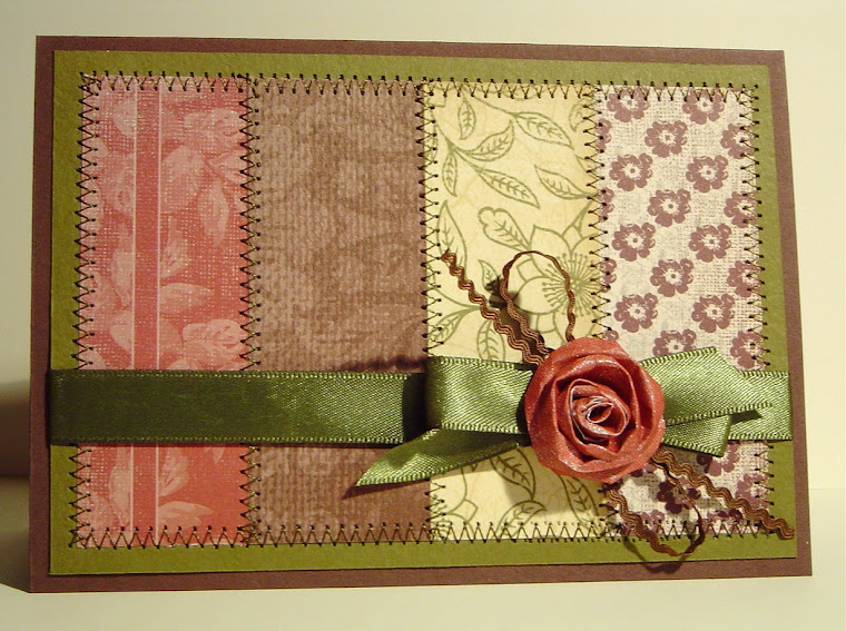
Paper: My Mind's Eye Lost & Found Madison Avenue & Christmas 6x6 packs, Collections (an Australian company) Vintage Rose 6x6 collection, Basic Grey Capella 6x6 pack, Creative Imaginations Beach Cottage 6x6 pack
Cardstock: SU! Kraft & Pink Pirouette, vanilla
Other: Tim Holtz Distress Stickles - Rock Candy, Derivan Matisse Mica Flakes, Stamp World Irridescent Sparkle embossing powder, Kaiser Rhinestones in wine & antique rose, DMC matallic tapestry thread, dimensional stickers
Tools: Carl holly sprig punch, Spellbinder Labels 18 die, PTI Love Lives Here: Holiday angel die, 3/4" circle punch

I had planned on using a similar (but less sparkly) version of this card as my 2011 Christmas card to mass produce, but it took AGES to make so I'm rethinking that idea - it would take weeks to make enough of these cards and I have other glittery Christmas plans to fulfill!
Thanks for looking.
-Kerri

Gate fold card

Hi there,

Thanks for visiting my blog!

This week, as part of Holiday Card Boot Camp, I have continued my attempts to push myself into card-making areas I haven't tried before - although it does mean that every card is taking twice as long as usual to make, as I keep changing my mind about the final layout and look. On Day 8, Jennifer McGuire made a card using a gate fold which I thought was gorgeous, so as I hadn't tried a gate-fold before, that was my challenge. Like Jennifer, I used a panel on the left hand side which, when the card is closed, is centred over the middle of the card, covering some of where the left and right hand sides of the card meet up:


When the card is opened, some of the embossed stamping which the panel covers is revealed - I quite like that aspect of this card, but I'm not entirely happy with how the card looks when it is standing up. Oh well, I guess that's all part of the learning, huh? The photos aren't really showing up the true color of the background paper - in RL it's a smoky, muted pink. The Inkadinkado stamp with snoflakes in it is delicious - and so are all the others in the set. I cna't wait to find more uses for them!


Details:
Paper: a subtle red with a rose print in it - can't remember the brand or name as it's quite old
Cardstock: thick watercolour paper, vanilla
Stamps: "Peace on Earth" from Stampa Rosa (several years ago), Inkadinkado Large Flourishes
Ink: Versacolor black, Tim Hltz Distress Inks in Aged Mahogany and Victorian Velvet
Other: Moon Glow Two Toned embossing powder in Midnight RUby (brand unknown)
Tools: Spellbinder Labels 2 die

I hope your own card-making is going well!
-Kerri

Tuesday, November 15, 2011

A Round Christmas

Hello!

I am participating in the Holiday Card Boot Camp - we're halfway through already! It's gone so quickly but I am having a ball. I don't think I've ever been so productive in my craft room.


Today's (...oops, I mean yesterday's - it's jsut ticked over past midnight) card was made in response to the round circle sketch, but it is only a loose interpretation. I rarely make cards that are not the standard size & shape, but I managed it this time, again pushing myself a little outside my comfort zone. Not sure I'd do this shape again, th0ugh...I also cut the circle card base freehand after using a CD as a template, as Jennifer suggested - another tiny step into the uncomfortable for me! I was going for a vintage look in traditional colours, as an antidote for all of the aqua I've used lately. I've resisted adding glitter so far, but I might yet....if you can't use glitter at CHristmas, when can you????


Details:
Stamps: PTI Tree Trimming Trio, Hero Arts Tiny Snowflakes, Hero Arts Classic Fabric Design Cling stamp
Ink: Versacolor black & gold, Tim Holtz Distress Inks in Frayed Burlap and Old Paper
Paper: Simple Stories 25 Days of Christmas 6x6 pad, Graphic 45 Wallflower (front & back designs), vintage kraft scrap (for the banner)
Cardstock: buttery cream from my stash
Other: clear embossing powder, buttons, gold tapestry thred, SU! Library Clip, dimensional stickers, craft glue
Tools: Spellbinder circle dies, Tim Holtz blending tool

Thanks for visiting!
-Kerri

Sunday, November 13, 2011

Photo time

Hi there,

I have 2 more cards to show today. One was finished late last night, but after midnight seemed far too late to create a post - despite the promises I made yesterday - but here it is!

I've been struggling for the past few days with the idea of creating a photo card for Christmas. It's not at all the kind of thing I'd ever consider normally, but I'm using Boot Camp as an opportunity to force myself into new and sometimes uncomfortable card-making territory. After several false starts and printer challenges, I have actually finished a photo card - although it might be the only one ever! For the purpose I've borrowed my nephew as the card subject as I had a few photos of him playing in a park with his mum on a recent holiday. 

The photos aren't particularly Christmassy (is that even a word?) but the colours converted OK, I think, to a kind of Nordic scheme. (Although I would barely recognise Nordic if I fell over it, so please forgive me if I'm totally off-base with that comment.) The white snowflakes have a very fine layer of glitter on them which doesn't show up well in the photo. I still need to find a sentiment for the inside, which says something inspiring about reaching new heights to suit the photo series - there was much excitement when the kid actually managed to climb to the top of the play equipment (mostly) on his own!


Details:
Stamps: PTI Holiday Photo Finishers, Stampers Anonymous Tim Holtz Grunge Flakes, Hero Arts Tiny Snowflakes (from many years ago when I first started stamping!)
Ink: PTI Fresh Snow, Versamark
Cardstock: all random pieces from my stash
Paper: Bo Bunny Unforgettable Dream (under the sentiment)
Other: red embroidery floss, Martha Stweart glitter, white embossing powder, fine tip glue pen, dimensional stickers

I've been so busy creating Christmas cards that I'm falling behind on other cards I need, so this second card was an attempt to redress that. It was inspired by one I saw and admired many months ago on Michelle Wooderson's blog. If you haven't seen it follow this link - she has a wonderfully relaxed and cheerful style and her cards are always quirky and fresh. I'm pretty happy with this card, although in retrospect I should have left the stickles off the flower centres - it looked better without them!


Details:
Stamps: PTI Friendship Jar SUmmer Fillers, Spiral Bouquet
Ink: Memento Rich Cocoa, Versacolor Pinecone, Tim Holtz Distress Inks in Evergreen Bough, Peeled Paint, Shabby Shutters, Dusty Concord, Aged Mahogany, Tattered Rose, Victorian Velvet, Milled Lavender (all used to paint the image)
Cardstock: SU! Blush Blossom, Kraft, thick watercolour paper, some lavender scrap
 Paper: Basic Grey Kioshi 6x6 collection
Other: stitching, ribbon, button, dimensional stickers, Frosted Lace Stickles, Perfect Pearls, Tattered Angels Glimmer Mist in Creme de Chocolat


Thanks for visiting!

-Kerri

Saturday, November 12, 2011

Snow Flurries - part 2

Here's a copy of the second card from the previous post, here only so I can link it to the HCBC gallery. Sorry for the repetition. Please look at the previous post for the card details.


-Kerri

Snow flurries

Hi there! I have two cards to show for my day so far but I'm hoping to make another tonight if my mojo doesn't disappear in the meantime.

I seem to be fixated on aqua at the moment - here are two MORE monochrome cards in that colour. The fixation has only gotten worse since I received my latest Simon Says Stamp order, which included the Christmas holiday distress inks from Tim Holtz. The new shade Evergreen Bough is EXACTLY what I am loving at the moment. I have all kinds of DP, ribbons, buttons, other inks, cardstock in various similar shades all over my desk. I LOVE it!

Part of the irony is that it's making me think of & create snowflakes and snow - hence the title of this post - despite the fact that I live in Australia and Christmas is in the height of our usually very hot summers! There's definitely no snow at Christmas anywhere near here, but it does look pretty on cards. And I detest the stamps you can buy to more truly reflect an Australian Christmas...like Santa surfing. Ugh.

Anyway, here are the cards. The first is an almost identical replica to one of those shown on HCBC by Jennifer McGuire. I usually try to avoid making replicas but her card was so beautiful I couldn't resist. I have made some small adjustments as I didn't have exactly the same supplies, but the result is pretty pleasing in RL. So thanks for sharing your beautiful work with us all, Jennifer!


Details:
Paper: Basic Grey Hello Luscious Succulent (reverse)
Cardstock: thick watercolour paper, white
Ink: Distress Inks in Evergreen Bough, Iced Spruce, Broken China
Other: Tim Holtz Grungeboard letters, Adirondack acrylic paint dabber in Pearl, white tissue paper (snowflake), silver tapestry thread, button, dimensional stickers, Perfect Pearls
Tools: Cuttlebug Victoria embossing folder, Spellbinders Labels Eighteen die, MFT snowflake die


Details:
Paper: Kaisercraft Party Animals Woo-hoo, My Mind's Eye Hazel "Fancy" - Lots of Dots (reverse side shwing)
Cardstock: Bazzil Basics olive shade, white, SU! Baja Breeze
Stamps: Waltzing Mouse Compliments of the Season
Ink: Versacolor Turquoise, Tim Holtz Distress Ink - Evergreen Bough
Other: white buttons, embroidery floss, perfect pearls, Kaisercraft Adhesive Pearl, dimensional stickers
Tools: PTI Christmas Tree die (from 2010), Uni-ball white Signo gel pen

That's it for now. More later tonight....maybe!
Thanks for looking.

-Kerri

Wednesday, November 9, 2011

Snowflake sparkle

Hi again,

This is my second post for today - it's just a few minutes before midnight as I'm typing. Here is another snowflake tree ornament card, inspired by Dawn McVey's second photo card in today's HCBC post. I am still trying to find a photo to use for a card - I suspect it might take me a while. Mostly my photos are of cards I've made, and although the idea of a card featuring a photo of a card kind of amuses me, I'm not so far gone that I'd actually make one! (Or am I? Hmm...) The photo here doesn't really show up the glitter that is stuck around the edges of the snowflake or on the heart, but you get the idea. If I made something like this again, I would make the snowflake thicker by sticking the manuscript onto some cardstock first. I was trying to make it seem delicate but in RL it seems a little too feeble.


Details:
Stamps: PTI Love Lives Here - Holidays
Ink: Versacolor black, Aged Mahogany Distress Ink and a very old unlabelled pink dye ink (on the heart)
Paper: old music, My Mind's Eye Lost & Found 2 - Blush 6x6 pack
Cardstock: SU! Kraft
Other: Adirondack Acrylic Paint Dabber Snow Cap (on the heart), Tim Holtz idea-ology Grunge Paper (for the heart), gold tapestry thread, ribbon, dimensional adhesive, gloss spray varnish (on the heart), Martha Stewart Crystal Coarse Glitter, PTI Snowflake die

Thanks for looking. I hope your Boot Camp card making is going well, if you are involved.

-Kerri

Tuesday, November 8, 2011

HCBC Day 1, part 2

Hi there,

Thanks for visiting. This morning I've had another go at making a card using the HCBC Day 1 inspiration ideas from Kristina and Jennifer - I was trying to capture the image I had in mind from yesterday, but again, the card had ideas of its own! However, I have included quite a few elements from the videos yesterday: some postage stamp edging and some dry embossing. I really liked the look of the pure white on Jennifer's card, so I've incorporated that. I found some colour inspiration in the paper you can see in the background - it's an old American Crafts design from several years ago. I almost added some of it to the card, but decided to keep it fairly streamlined. (I haven't made a card without designer paper of some sort in a long time. Good to break the dependency every now and then.) It's a more CAS design than I usually try, I think. I have had to use all my willpower to resist adding glitter to the snowflake! I might still...what do you think? Although I haven't made a tree bauble this time, the snowflake is my substitute.

Details:
Stamps: PTI Tree Trimming Trio
Ink: Versacolor Black, Gold
Cardstock: white, matte gold, red, SU! Kraft, Kiwi Kiss (maybe?)
Other: Tim Holtz Alterations Die - On the Edge Postage, MFT (I think) Snowflake die, button, twine, stitching, Cuttlebug embossing folder - Victoria

And....here's a closeup, for the link to the HCBC gallery.


OK, just an hour or so until the Day 2 HCBC post (woo-hoo!), so maybe there'll be another post later tonight.

Bye for now,
Kerri

Monday, November 7, 2011

Boot Camp Begins!

Hi there,

Today is the first day of the Holiday Card Boot Camp and I am very excited to start! I am determined to make a card using the techniques, ideas & inspirations most days at least, for the 2 weeks. We'll see how that intention plays out (hopefully better than usual) but at least I've made a good start.


I made this card today as soon as I could after viewing the video posts. I took several ideas from Jennifer & Kristina's cards: two similar tones, a tree branch with a hanging ornament, rhinestone tree berries, small Versamark background stamping....it turned out ENTIRELY different from what I had in mind at first. Funny how that happens sometimes - you have an idea but the card itself almost seems to want to take you in a different direction. I'm also a little surprised by the colours I've used - the last 2 cards have been blue-green, which is a palette I rarely use. However, I am a little pulled towards that colour-of-glass shade at the moment. Kind of vintage but fresh at the same time.


Details:
Stamps: Heidi Grace Marina Dr., Waltzing Mouse Complements of the Season
Ink: Versacolor Gold, Versamark, Versamark Dazzle Champagne, Tsukineko Encore Ultimate Metallic "Sweet Dreams" (on edging of two smaller baubles)
Paper: My Mind's Eye 12 Days of Christmas 6x6 pad, My Mind's Eye Lost & Found Market St "Happy Birthday", My Mind's Eye Fine & Dandy Tickled Pink "Wonderful"
Cardstock: SU! Blue Bayou, cream
Other: Gold embroidery thread, Kaisercraft rhinestones, dimensional pop-up dots, Artee gold embossing powder

The photo is a little over-bright, sorry - I am having trouble getting the lighting right as so often I am taking photos at night. With the flash is too bright, without is too dark....Some more experimenting is needed, I think.

I still have my original plan in mind, so maybe tomorrow I'll have another stab at it and see if it's more obedient the second time around.

Thanks for visiting!
Kerri

Sunday, November 6, 2011

Baby cards

Hello!

It's the night before Christmas....card camp, that is! I can't wait to start. I should also be getting my latest PTI package in the next day or two because according to the tracking info it's now cleared customs in Australia. Yay! So, lots of card making in the next couple of weeks, I hope.

In the meantime, I've made a couple of baby cards for a friend from work who had a baby recently. I wasn't sure if she'd had a boy or girl, so I made one of each. I've since discovered that the baby is a boy, so now I can send the card and save the baby girl card - I have no doubt it will get used soon, at the rate babies are arriving.

The baby girl card uses a stamp I bought months and months ago and hadn't yet used. I am just beginning to learn how to colour hair so it looks real. I think this is a reasonable effort but obviously there's a lot of improvement that could be made....Basically, I REALLY want to buy some Copics but can't justify the cost unless I build up my colouring skills to warrant them. I had intended to colour the whole image but gave up and paper pieced the dress and teddy instead. Oh well. The torn strip on the tag is covering up a stamping error, which then dictated the torn edges on the background paper. It's a little obvious to a card maker, I think, but probably wouldn't ccur to others as a "fix-it" (I hope).


Details:
Stamps: Bells 'n Whistles "Eden with Teddy", SU! "So Many Sayings"
Ink: Memento Rich Cocoa
Cardstock: SU! (Retired) Blush Blossom, white, scrap dark brown
Paper: Marianne Design "Sweet Romance" 6x8 pack
Other: seam binding, PTI silk ribbon dyed with SU! Blush Blossom reinker, vintage button, white tag from stationer, water colour pencils
Tools: Spellbinders Labels 11 die, PTI die (maybe from the Friendship Jar series?)

With this card I was trying really hard to avoid making a typical pale blue card. I remember when my sister had a baby boy that almost every single card they received was pale blue & white! I still went with blue, but tried for a stlightly funkier feel with some more energetic paper and an aqua shade rather than sky blue. In RL the aqua tones come across more strongly.


Stamps: PTI Bitty Baby Blessings, Stampabilities Tapestry Pattern
Ink: Versacolor Black, Versamark, Broken China Distress Ink
Cardstock: white, SU! Blue Bayou (is this one retired, too?)
Paper: Basic Grey Out of Print 6x6 set, My Mind's Eye Hattie 6x6 set, Webster's Pages Ladies & Gentlemen & Trendsetter 6x6 double pack
Other: white cotton (hard to see in this photo - a zigzag along the scalloped piece), ribbon, dimensional dots, aqua marker
Tools: Spellbinders Labels 2 die, Tim Holtz/Sizzix Alterations die - On the Edge

That's all for now, but hopefully there will be another post soon. Thanks for visiting.

-Kerri

Thursday, November 3, 2011

Recent efforts

It turns out keeping a blog going is much harder than it seemed when I first started! It's been ages since my free time and the inclination to post have coincided. I had an insanely busy term 3 this year, which meant very little time for card making anyway....but I'm determined NOT to start every post with a "sorry I haven't posted for so long" message, as so many blogs I have read do, so all I will say is how much admiration I now have for the many, many, many people who are more regular bloggers than I.

I have had more free time to make cards recently, as I am on Long Service Leave for 4 months - bliss! For anyone reading outside Australia, this is an industrial remnant of the colonial days when people needed time to hop on a ship to go back to Britain to visit friends and family a couple of times in their lives. The fact that plane travel makes it completely unnecessary for such a long break has had no bearing on contemporary industrial relations, so I have until the end of January to be tied back in to my "normal" crazy work schedule!!! So after several weeks of just recovering some energy and inspiration, my creative juices are flowing again.

I'm also signed up (as of today) for the Holiday Card Boot Camp, so there should be many more pictures coming soon. Although, at this stage I am signed up just for general card-making tips & techniques. I already have a design in mind for my Christmas cards this year & am just waiting for my recent Papertrey Ink order to arrive before getting stuck into the production line. However, the two previous on-line card classes have been sensational & have given me LOTS of inspiration & new techniques, so I am sure I will get a lot out of it.


So, here are the cards I actually like & have managed to take half-decent photos of since my last post.


Stamps: PTI Tea for Two & Tea for Two additions
Cardstock: Vanilla
Ink: Versacolor Celadon & Pinecone
Paper: Webster's Pages 6x6 Ladies & Gents & Trendsetters pack, Creative Imaginations 6x6 Beach Cottage pack, My Mind's Eye Lost & Found Blush 6x6 pack, can't remember where the script scrap came from...
Other: Seam binding coloured with Distress Ink in Victorian Velvet, pom-pom ribbon, mini ric-rac, Kaisercraft pearls, Perfect Pearls powder, pale yellow paper & wire flower, stitching
Tools: Tiim Holtz/Sizzix Alterations Die (On the Edge), PTI label die


Stamps: alphabet stamps from a really old, cheap set that came with some even cheaper ink from Kmart...
Ink: Versacolor Pinecone
Paper:  Webster's Pages 6x6 Ladies & Gents & Trendsetters pack
Cardstock: SU! Kraft, Chocolate Chip, Kiwi Kiss (?)
Other: alphabet stickers (can't remember brand), button, twine
Tools: corner rounder (Carl Punch)


This card is a case from Melissa Phillips - I LOVE her style but can never seem to replicate it {sigh} - so delicate, whimsical & pretty! Her original card is here. If you haven't visited her blog before, I HIGHLY recommend you dediacte a few hours, a comfy chair & a pot of tea to explore it!

Paper: a whole lot of tiny scraps, can't remember the rest as I made this card quite a few weeks ago (sorry)
Stamps: PTI Boards & Beams, Layers of Color Art Stamps - Nature Walk
Ink: Versacolor Green Tea, Distress Ink Old Paper, PTI Vintage Cream
Other: Maya ROad Houses Mini chipboard set, buttons, embroidery floss, seam binding coloured with Tattered Rose Distress Ink, stitching, spray varnish


Stamps: Hero Arts Clings Flower Pattern, Hero Arts Made With Love clear set
Ink: Memento Ink Tuxedo Black, Archival Brilliance in Pearlescent Crimson; Distress Inks in Dusty Concord, Aged Mahogany, Victorian Velvet, Broken China & Peeled Pain (used as paints)
Paper: Basic Grey Oxford 6x6 pad (for the green background)
Cardstock: Watercolour paper, 2 shades of purple
Other: Perfect Pearls, seam binding coloured with Victorian Velvet Distress Ink, Rhinestone flower button, clear embossing powder, pop-up stickers
Tools: Spellbinder Labels 4 die


Paper: from a small selection of offcuts, printed in Australia - brand unkown
Ink: Versacolor black, silver
Carstock: white, black, SU! Kraft
Other: ribbon, lace, black flower brad set, Perfect Pearls, clear embossing powder, pop-up stickers
Tools: Spellbinders Labels 4 die

Well, that's it for now! Hope you enjoyed them.

-Kerri

Wednesday, July 20, 2011

Sailor Boy - Card Camp continues

Hi there,

(This is my second post for today. Read the earlier post for more details.)

This card uses a watercolour wash I made yesterday. This week's colours are so vibrant and I can't get the ocean out of my head when I look at them, so in this card I've gone for a more literal interpretation, using a really cute stamp set I don't often get a chance to play with.


I've also used the technique from yesterday's Card Camp video, with clear plastic as a window, although I didn't actually stamp on it. You can't really see in the photo, but I've added Glossy Accents to the fish and the submarine portholes, and Distress Stickles on the sea stars (NOT star fish, as my biology teacher friends keep reminding me). I know that the oranges aren't part of the colour combo for this week, but I just couldn't resist. (Also, I know, gold fish at the bottom of the sea are unlikely.)

But all up, it's a cute card that will be perfect for a little boy I know whose birthday is coming up soon!

Here's a close up (mainly for the Card Camp gallery link, sorry).


Supplies for this card - a HUGE list (madness, I know):
Cardstock: SU! Kiwi Kiss, white water colour paper, PTI Terracotta Tile, Orange Zest & Summer Sunrise
Paper: Kaisercraft Utopia collection (blue spots), Pink Paislee Bayberry Cottage Collection (green tones), silver, some random scrap in blue & green (used for the seaweed)
Stamps: Waltzing Mouse Half Pint Heroes
Ink: Versamark, Versacolor Black
Other: Clear plastic sheet (cover pages for binding, from office supply store), silver embossing powder, Ranger Distress Stickles in Rock Candy, Jones Tones Plexi Glue (fabulous stuff!), Glossy Accents, Marvy Le Plume marker (blush pink), MFT grass die (I used the off cut, inverted, for the seaweed), water clour paints, deckle-edge scissors
...I think that's everything!

Thanks for looking.
-Kerri 

Friends - Card Camp continues

Hi there,

I have two cards to show today, so there are two posts (which means I can easily add 2 pictures to the card camp gallery).

Yesterday when I was playing with colours I made two water colour washes using this week's colour combo. I had to let them dry before I could turn them into cards, but here is one of them:

Supplies:
Cardstock: heavy water colour paper, vanilla
Stamps: PTI Turning a New Leaf, Hero Arts Lauderdale Floral
Ink: Versamark
Other: water colour paints, Kaiser adhesive pearls, white embossing powder, Signo Uniball white pen

I quite like the clean lines of this. Again - I would never have thought of it without the techniques & colours I've come across through the card camp!

Let me know what you think in the comments!
Thanks for visiting.

-Kerri

Tuesday, July 19, 2011

Week 4, Day 2

Hi there,

I had so much fun making cards yesterday that I changed my plans for today so I could keep going. I had lots of work-realted tasks I was SUPPOSED to do instead...but they'll keep. I did have fun, but so far I have only one card to show for the day. Some other pieces for another card for this week's colour combo are drying, ready to be finished tomorrow.

I got my inspiration for today's card from a small tag piece in the back of a Kaisercraft 6x6 pad. It wasn't in the right colours, but I really liked the look of subtle, overlapping images in slightly different shades of one colour family. I thought the style suited this week's colours.


I used LOTS of different stamps & inks for this - my desk was a huge mess by the end. I also sprayed the stamped panel with Glimmer Mist, as I thought it was starting to look like a wedding or engagement card & wanted to glitz it up a bit while still keeping it very clean-looking. It was very difficult to resist the temptation to add some more pattern/texture/ribbon/rhimestones somewhere else...I still can't decide whether I should have or not.

You can see some of the detail better in this shot:


 I think it looks a bit better in real life, though - even more so than usual!

Supplies:
Cardstock: SU! Taken with Teal, PTI Aqua Mist, white cotton (?) textured, plain white
Stamps: Kaisercraft Script & Empire Collection, Grace Taylor Love, Heidi Grace Marina Dr., Stampers Anonymous (Tim Holtz) Shabby French, PTI Background Basics: Newsprint
Ink: Versacolor in Sky Blue, Split Pea, Green, Baby Blue, Sage, Turquoise, Celadon
Other: Tattered Angels Glimmer Mist in Dazzling Diamonds

That's all for now. Thanks for visiting.
-Kerri

Monday, July 18, 2011

Summer Card Camp - Week 4

Hi there!


I've tried really hard today to get a card made on the FIRST day of the new color challenge - and I have managed it. Lucky, because being Week 4, it was my last chance. It's another card which is quite a change from my usual style. Although I like making vintage cards with lots of details & layers, I am always taken by the clean and simple modern cards I see on the internet. Today's very fresh, calm colors inspired me to try something simpler than usual. The irony is that this card took as long as any of the others I usually make, even though it seems to have fewer elements.


I've also taken the big step with this card of using some of the vintage buttons I've recently inherited from my great-grandmother's stash. I've had them for a few months but haven't used them until now. It's very amusing to think that perhaps my own tendency to hoard craft items is a link back to my ancestors!


Supplies:
Cardstock: white & a very pale aqua from a sample pack of watercolour papers
Ink: Versacolor Celadon
Stamp: Waltzing Mouse Half Pint Heroes
Other: embroidery floss, PTI Beautiful Blooms II flower die, vintage buttons

Here's another card I finished today - it was supposed to be finished in time to put it in the Week 3 gallery, but I didn't make the deadline. Oh well. I figured the more cards I had in the gallery, the greater the chances of winning one of the prizes....but it turns out I won one anyway! I got an email to say I won the Sizzix Alterations die pack - AWESOME!!!!! I don't have any of these dies & I've been wanting the label die set for ages. I am SO happy!


Supplies:
Cardstock: SU! Chocolate Chip, Vanilla, a caramel piece from a swatch of Core'dinations
Paper: Cosmo Cricket Mini Deck - Garden Variety
Ink: Versacolor Scarlet, Ranger Distress Ink - Antique Linen
Stamps: PTI Tea for Two
Other: PTI Tea for Two Collection die, PTI Mat Stack 3 die, ribbon


You might also have noticed I've finally figured out how to make the photos bigger on the blog. Now all I have to do is figure out how to make the page scroll faster - probably take the photos with a smaller file size on the camera? If you're reading this & you know what I'm doing wrong, please let me know!

That's it for now. Thanks for looking.

-Kerri

Friday, July 15, 2011

You're Sweet


Hi there,

Here's my next Summer Card Camp finished card. It's quite a variation on my usual style, with the hand stitching giving it a country feel, but I really like it! I hope you do, too.


Supplies:
Cardstock: dark brown, caramel, SU! Kraft
Paper: Cosmo Cricket (from Early Bird series, can't remember which one), another unidentified scrap from my stash
Stamps: PTI Friendship Jar & Tea for Two
Ink: Versacolor Pinecone (my favourite!)
Other: embroidery floss, red ribbon, scallop circle Nestabilities

Thanks for looking.
-Kerri

Tuesday, July 12, 2011

Card Camp - Week 3

Hi there,

It's been a slow start to Week 3 for me, despite my enthusiasm about this week's colour combo - there have been several other things competing for my time and attention. Nevertheless, I have made one card I am keen to post & I think I'll have a bit of time in the next two days to make more. (But then again, the best laid plans and all that...)


So here it is. It looks pretty simple, which fails to take into account the TWO HOURS I stuffed around with it. I made so many errors (eg. the distressed edges were NOT intentional, but I stuck the cream card on crooked & then tried to trim it back to straight, then stuffed up the cut & had no choice but to distress it to cover up the mess) - and I cut myself with my scissors. You'd think I was a toddler! Years and years of playing with stanley knives and craft knives and I cut myself with the scissors! Aargh. But in the end I think it turned out ok. (The card, I mean - the cut is right on my knuckle & will be a nuisance for a few days.)


Supply list is pretty limited, as I was using scraps of paper & card & don't know anymore what brand almost any of them are. Sorry. But here is what I do know:

Stamp: Kaisercraft sentiment (from a new mini clear stamp set)
Ink: Ranger Distress Ink - Barn Door
Cardstock: SU! Chocolate Chip (or maybe Espresso?) and cream; Bazzil Basics (?) - the mid brown stripe, don't know what shade it's called
Paper: Gold strip, red printed flowers, tan script
Other: Embroidery floss, Paper flower & leaf, Tim Holtz Grungeboard heart, Glossy Accents (on heart), Twinkling H2Os (gold sparkle on flower) 

I've also played around a little with my camera to try to create a better (square) shot to link to the Card Camp Gallery....hmm. More practice needed! Lucky there's still (almost) 2 weeks left, ha ha.


 Thanks for looking!
 -Kerri

Sunday, July 10, 2011

Stamping room organising & inspiration

G'day!

I've had a very productive card-related two days! (At last.) To start with, I've re-organised lots of my supplies, mainly inspired by the addition of a new (to me) 2 drawer filing cabinet. This was intended to help store my ever-increasing collection of paper, which it now holds, but it meant that lots of things needed to be moved around to make the most of the space. A general tidy-up was also in order, so I grabbed the bull by the horns and did it all. The most exciting part of it was that I have now finally filed all the papers I'd jammed into a magazine holder after I used pieces of them over the last year or so. Originally it started out as a "I'll put these away tomorrow" collection, but of course that got completely out of control very quickly! Now they are in suspension files in colour groups - much more practical.

So, after spending a few hours yesterday & today sorting and re-filing, I then had to make use of the newly clean and inviting space....so I've also finished four cards today, two of which I'd been stuck on for quite a while. I'd like to keep making more, but it's already after midnight.

First up, here's a card I made last week for the Summer Card Camp using the Week 1 colour combo. I wasn't really sure about it at first. I'm still not, but at least now I'm happy enough with it that it's not going in the bin. It was also my first attempt at simulating the Copic colouring style for hair that I've seen on so many blogs. I used water colour pencils instead, but the hair is the part of the card I'm happiest with. And I finally managed to find something to stick down the tulle bow - that was a challenge.


Supplies:
Stamp: OA Happy Day from The Greeting Farm
Cardstock: SU! blue, hot pink, white
Paper: from an old Sizzix mini-pad
Ink: Memento Tuxedo Black
Other: water colour pencils (Faber-Castell Albrecht Durers - AWESOME), ribbon, button, tulle, embroidery floss


Today's cards....

Love this one! I think I'll be using this stamp a lot. The contrast in colours between the sky & the sea is a little greater in real life. Obviously, my photography will need some work if I aim to keep up this blog!


Supplies:
Stamps: both from Noah's Ark by Jane's Doodles
Ink: Memento tuxedo black, Distress ink in Broken China for sky background
Cardstock: not sure what brand...pale blue & white, watercolour paper for waves
Other: Faber-Castell Albrecht Durer watercolour pencils, el cheapo watercolour paints, PTI cloud dies, dimensional glue dots

The next card is one I've been trying to finish for several weeks - I had the yellow and red panels finished but couldn't decide what to add to it.


Supplies:
Cardstock: SU! Kraft & Chocolate Chip, Bazill Basics kiwi shade, PTI Terracotta Tile
Paper: October Afternoon - The Thrift Shop (Still in Box)
Stamps: Kaisercraft Flourish, Purple Onion Designs sentiment
Ink: Versamark, Varsacolor Pinecone
Other: button, floss, clear embossing powder

The flowers on the next card were painted many weeks ago, but again, I couldn't quite put it together to my satisfaction until now. I'd originally stamped two sets of tulips and painted the other one in deeper pinks and purples. I quite liked the card I made with that version, but didn't want to use the same layout twice. I think the weeks of having this one just sitting on my desk gave me the distance to think of the image from a fresh perspective. 


Supplies:
Cardstock: kiwi textured - from my stash, SU! Pink Pirouette, watercolour paper
Paper: The Girls Paperie (oops, have thrown away part of the label, don't know which design it is), Making Memories Eliza Yellow Brocade
Stamp: from Papertrey Ink Frienship Jar Spring Fillers
Ink: Memento Tuxedo Black
Other: water colour paints, ribbon, button, sewing thread

Finally, here's my first attempt at using sticky-back canvas. Not so sure about this card, but I do like the faded jeans look of the canvas.


Supplies:
Cardstock: all from my old stash
Stamps: Artee Stamps Large Funky Flower Garden, Papertrey Ink Up, Up & Away (for sentiment)
Ink: Memento Tuxedo Black, Tim Holtz Distress Ink Broken China
Other: ribbon, Twinkling H2Os, SU! scallop border edge punch, black felt-tip pen

I think that's enough for today! Hope you like them. I have just a few more half-finished elements on my desk, so my plan is to turn all of them in to completed cards this week, too. And then more Card Camp colours....maybe I'll get somewhere near that 48 card total if I can keep up this card frenzy!

Thanks for stopping by.

-Kerri